Now that you know how to create a tipo and add fields to a tipo, let's check out how to configure a particular field in a tipo.
Tipotapp allows you to configure each field in a tipo. There are lots of setting configurations which you can play around to get used to it. In this article, we'll discuss about the basic settings required for a field. All advanced settings are explained in the upcoming articles.
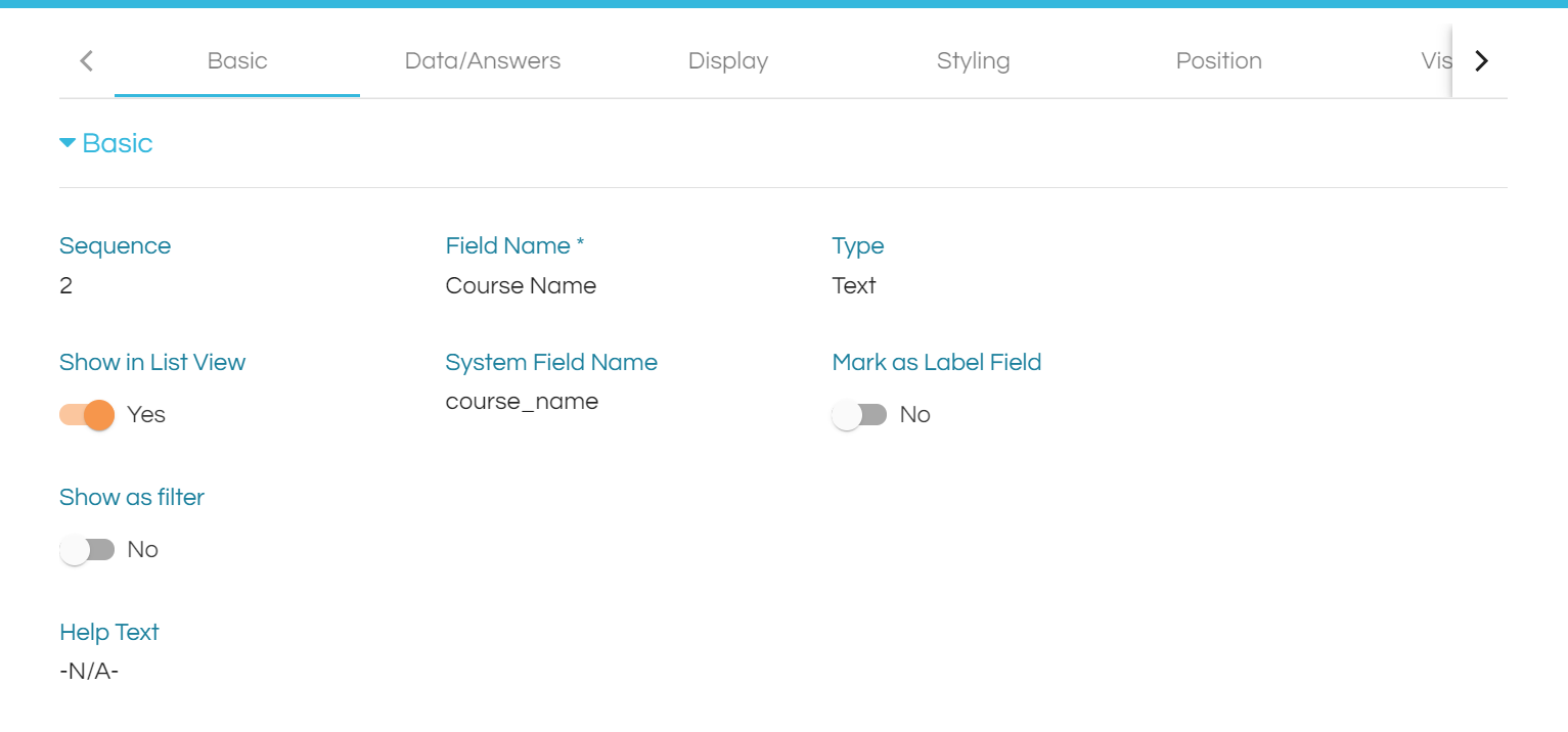
When you click on Edit action of a field, you'll land up in the configuration/settings page of that field. This is the place where you can configure the settings.
Let's now check out the basic functionality of each tab.
DATA
This tab allows us to enable multiselect, default value and dropdown functionality for a field.
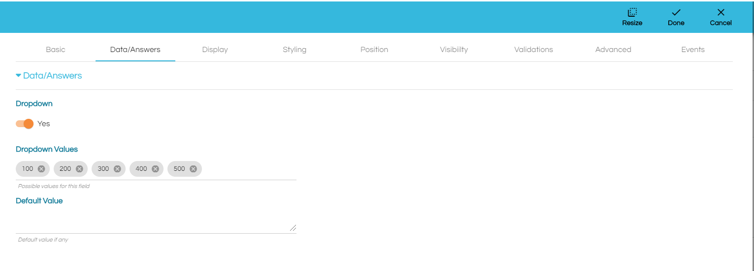
Allow Multiple Values is enabled when there is a need to enter/select more than one value.
If Mark as Dropdown Label is enabled, this field name will be used as the label in a dropdown.
To explain what this does, let’s first take a look at the Course Tipo in the Student Management App in sample apps. As mentioned previously, a Course will have the following fields: Course ID, Name and Units. In a Student record, a Course has Units, which will have will be of type Unit. In creating a Course record, Units are selected through a dropdown menu. By default, or if none of the Unit fields are set to Mark as Dropdown Label, the Unit ID appears in the dropdown menu and not the Unit Name. This will make it hard to identify which Unit to add to a Course. To address this, turn on the Mark As Dropdown Menu feature for Unit Name to have the Name be visible in the dropdown menu and make it understandable.
If you mark more than one field of a Tipo as Mark as Dropdown Label only the first field that has been marked as Mark as Dropdown Label will be considered.
Dropdown once this is enabled, you will see a section named Dropdown values where you can enter the list of values you need to show as a dropdown. If Allow Muliple Values is also enabled, then you can select multiple values in the dropdown. You can also provide a default value for the dropdown in the Default Value section.
Default Value can also be used as a standalone setting.
DISPLAY
This tab includes the settings used to control the appearance of the field.
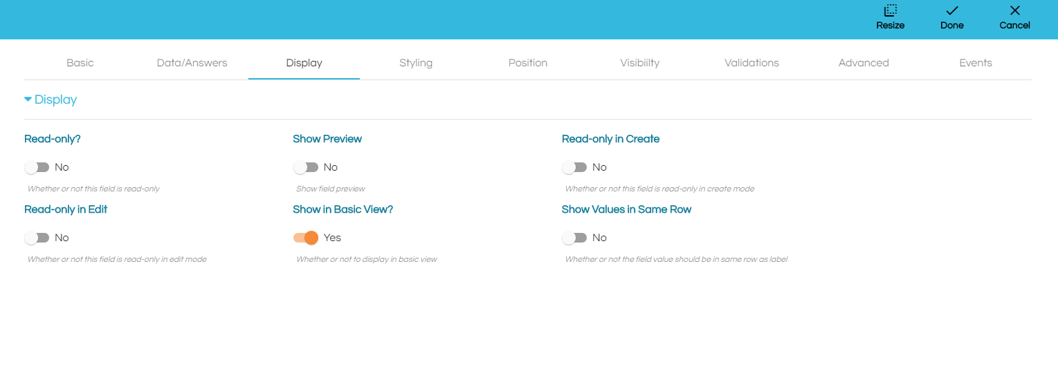
This tab is pretty much self-explanatory. The section heading describes the functionality of the setting.Read-only this option is used to select if the field needs to be read-only ie. do not allow editing.Show is used to describe which are the views to show this particular field.
STYLING
This tab includes the settings to apply css styling for the label & value.
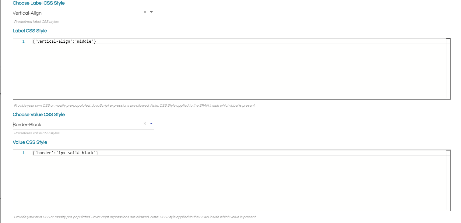
You can select a predefined style or add your own css for label and value as shown above in the image.
All the other settings are a bit advanced and will be explained in the upcoming articles.
Comments
0 comments
Please sign in to leave a comment.